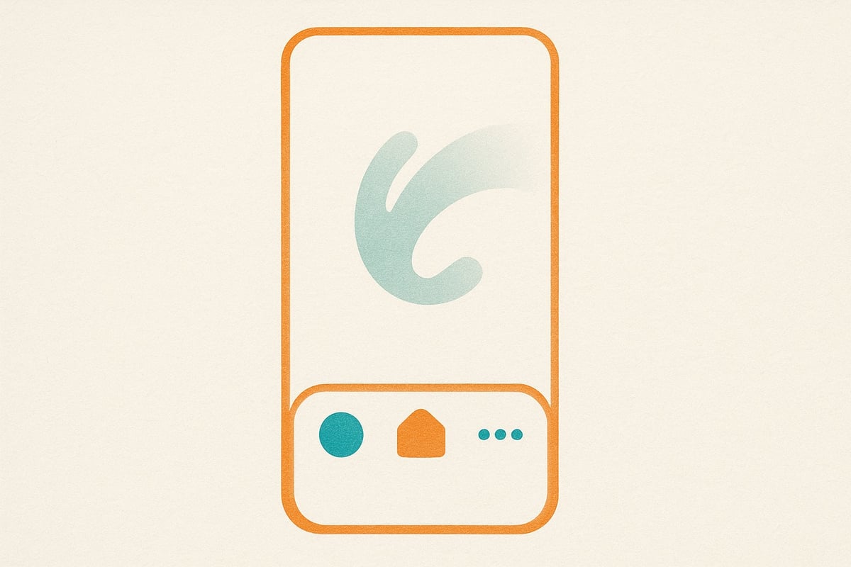
Bottom Navigation for Mobile & Tablet
Mobile navigation just got better. We added a persistent bottom navigation bar for mobile and tablet users—thumb zone optimized, always accessible, automatic hide on scroll down for reading space. Quick access to Brands, Founders, Insights, Markets without scrolling to the top. Platform conventions (Instagram, Twitter) meet 2025 web UX.
Mobile navigation just got better. We’ve added a persistent bottom navigation bar for mobile and tablet users.
What Changed
Before
- Top-only navigation (requires scrolling up to switch pages)
- Hamburger menu for secondary navigation
- Harder to jump between sections while browsing
After
- Bottom nav bar always visible (thumb-friendly)
- Quick access to Brands, Founders, Insights, Markets
- 44px touch targets (iOS Human Interface Guidelines)
- Automatic hide on scroll down (more reading space)
- Reappears on scroll up (always accessible)
Why Bottom Navigation?
Thumb zone optimization: On phones 5.5" and larger, the bottom third of the screen is the easiest area to reach with one hand.
Context switching: Users can jump from a brand profile to market insights to founder stories without scrolling to the top.
Platform conventions: Native apps (Instagram, Twitter, YouTube) all use bottom nav—it’s familiar and intuitive.
Responsive Behavior
- Mobile (< 768px): Bottom nav visible
- Tablet (768px - 1024px): Bottom nav visible
- Desktop (> 1024px): Traditional top navigation only
Technical Details
- Sticky positioning: CSS-based, no JavaScript required
- Touch-optimized: 44px minimum target size
- Animated transitions: Smooth show/hide on scroll
- Accessibility: Proper ARIA labels, keyboard navigation support
What’s Next
We’re exploring adding a search icon to the bottom nav for even faster access to our brand database.
Try it out—open Brandmine on your phone and explore. Navigation should feel natural and effortless.
 Skip to main content